
Revelstoke logo update open for voting
City’s new Communications Coordinator says new Revelstoke logo will be key to streamlining communications and creating a core visual theme.

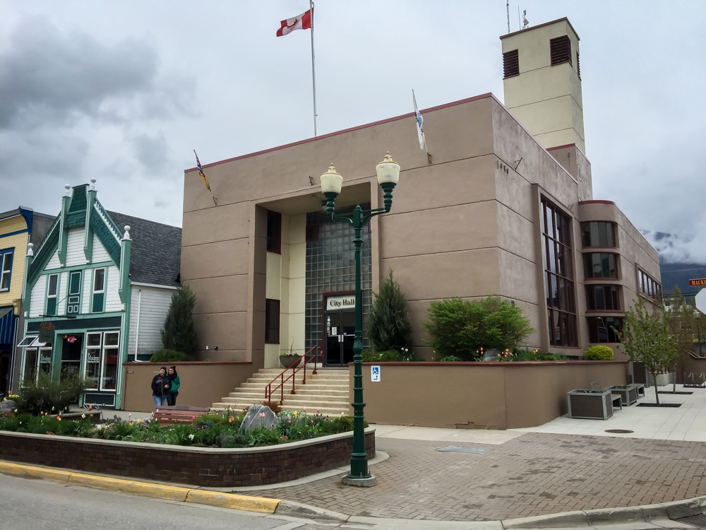
Revelstoke’s city logo is getting a revamp in an effort to harmonize Revelstoke’s visual elements.
“You go around town, and there are all of these design elements that don’t match up entirely,” Francesca Williams, City of Revelstoke’s new communications coordinator told Revelstoke Mountaineer. “People might not be up front aware of it. But your brain notices the disjointed visuals.”
Logos and branding for the City of Revelstoke aren’t unified across city signs, letterheads, physical and digital graphics or even on city work vehicles, something that Williams wanted to tackle as one of her first projects.
Why the Revelstoke period?
Critics of the “Revelstoke period” wondered why the future logo would continue with the punctuation found in the city entrance sign at Woodenhead Loop and throughout Tourism Revelstoke’s branding.
“It’s 100 years old, from Revelstoke itself,” Williams said, explaining it is an element carried over from one of the old rail stop signs at the Revelstoke train station.
Connecting the history of the Canadian Pacific (CP) Railway to todays goals of bringing in a broad audience and maintaining momentum is something Williams sees reflected in the Revelstoke period design that’s becoming a staple around town.
“It’s a brand used by a strong driver of Revelstoke’s early economy, and it’s something that will help us push further.”
Other key factors of Revelstoke’s identity were included not just in the image possibilities for two of the logos, but in the colour scheme as well. The burgundy red that hails from CP Rail is often found throughout Revelstoke and has been included in the logo plan. Forest green is also included as an option to highlight the temperate rainforest that sets the Revelstoke region apart from so many other mountain towns.
“As a nature girl at heart, I think the natural surroundings are really what brings people here,” Williams said. “And even what brings people back home here.”
Those core elements will help keep Revelstoke’s history and environment part of the brand, even if the winning logo design doesn’t include a grizzly bear or mountain element.
Revelstoke logo artists
Williams initially designed the four logo options, referring to them as the building blocks for the community to see what was possible. Critics of the proposed Revelstoke logos voiced frustration that a key part of Revelstoke’s identity seemed missing from the designs: the art scene that is becoming a staple of the town’s identity.
Why not commission someone from town to bring their knowledge of Revelstoke’s nuances to the forefront of the Revelstoke logo design?
William’s explained that would be a part of the final process, focusing on using time and budget to create a “mock-up sketch” to gain feedback and then receive direction from council once community input is collected. Once the feedback portion of the process is complete, the next step is to find a local artist to develop the Revelstoke logo with an eye for the finer details of design.
Bringing a designer on right at the start to create four logos, with the knowledge that three would most likely never be used, would put a strain on the project budget, Williams explained.
Still, she’s excited to connect with designers and artists in Revelstoke’s growing arts network to bring the selected logo to a polished level. But why not open the initial design project up for aspiring and seasoned artists alike to take a shot at?
“Logos need to be accessible, I’m really keeping that as a focus,” Williams said. Logos require the ability to change size without losing key details as they’re fitted to the side of a city vehicle or added to the bottom of a communication memo.
“We have so many incredible opportunities in this town for artists. Places where they’re not so restricted.”
Community input for the future Revelstoke logo
Currently, voting for the new logo has over 225 votes on TalkRevelstoke and more community input from the reveal of the logo options at the Revelstoke Winter Carnival.
This project being the test for how the new communications role services Revelstoke is not lost on Williams, who is instead eager to learn how best to connect with community members, find ways to gain feedback from often missed community groups and overall create a streamlined communication style for the City of Revelstoke.
Residents can vote on their favorite design idea through the TalkRevelstoke site and by attending various pop-up events that will take place at Revelstoke Community Centre, Revelstoke Secondary School, Revelstoke Senior Citizens Association and Save-on-Foods. Williams encouraged residents to attend these events, select the “other” option and provide feedback on the online voting or connect with her via email at [email protected].
“We can’t actually use the comments on socials. So, please, if people have feedback I encourage them to email me or fill out the vote or even come meet me at one of the pop-up’s.”
Williams is especially eager to hear feedback from students at Revelstoke Secondary School and learn what Revelstoke’s next generation thinks of the logo that will represent their potential future home.
“They’re arguably the ones going to be seeing it the longest. They deserve to have their say.”
Voting will close Sunday, March 31 and Williams will present the findings and potential winner to council who will then decide what logo to go forward with. Council does have the right to make minor adjustments to the chosen design or to continue using the existing logo. Then Williams and staff will work with resources in town to finalize the project and overall Revelstoke branding guide. The chosen Revelstoke logo will be unveiled on Canada Day by the City of Revelstoke.
What did you think of this story?
Your feedback after we publish a story helps ensure we're always improving our reporting to better serve you
Author
Related Articles
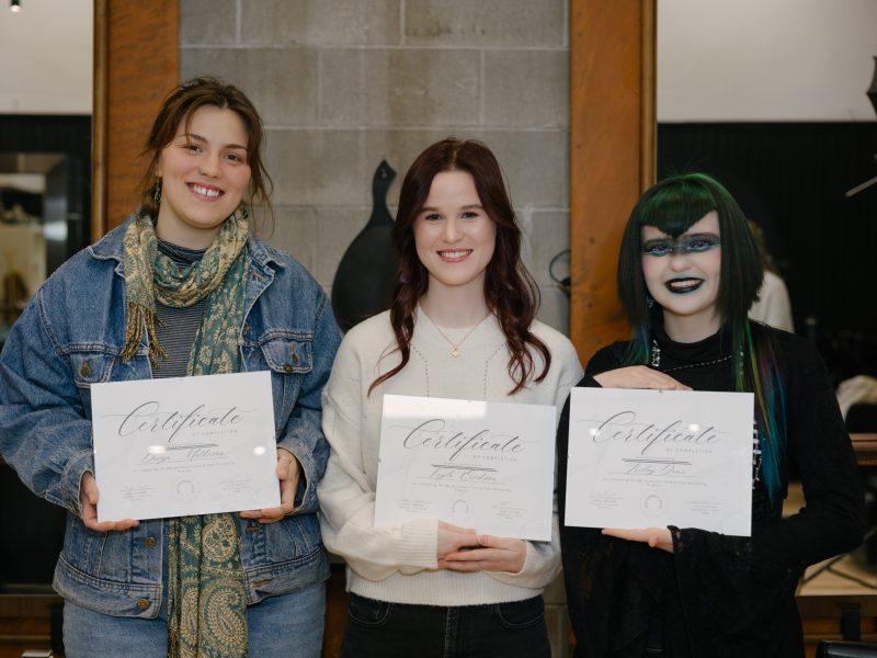
Birch and Lace salon offers apprenticeship-style academy for future hair stylists
The skills program aims to keep residents in town and learning in-house as salon founder focuses on accessible education opportunities.
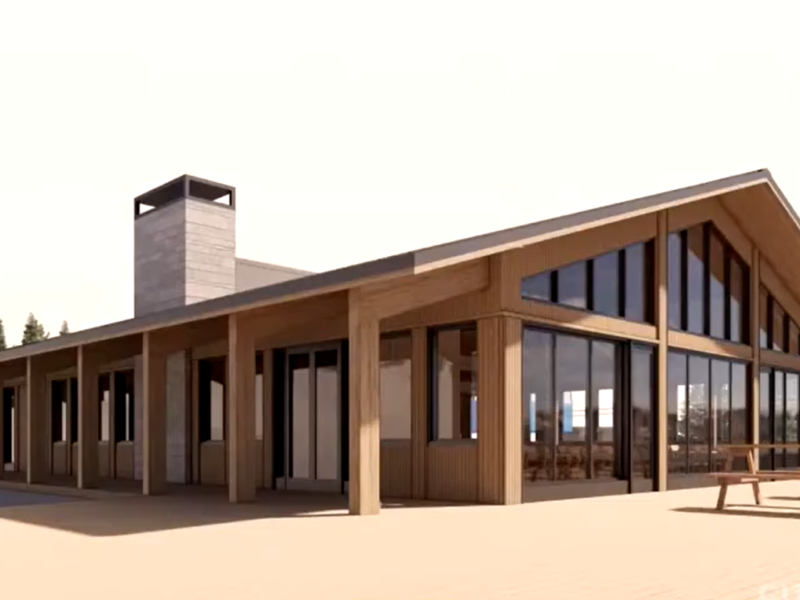
Revelstoke Mountain Resort provides updates on infrastructure upgrades and partnerships
Resort president Jason Kelder shared planned changes coming to the resort, which include a new warming hut.
Glacier National Park trails remain closed following heavy avalanche season
Balu Pass trail, along with two others are closed indefinitely as Parks Canada staff evaluate how much of the popular trails will need to be rebuilt.